Ebihara Rogen
書道家、墨アーティスト 海老原露巌
海老原露巌は書道に基礎を置く現代アーティストだ。
そもそも、東アジアを代表するアート、書道とはなんだろうか? 答えはズバリ、そこに描かれているものが絵画ではなく、文字であることが条件で、文字の美しさ、字形のみならず、そこに込められた精神性が問われる言語アートである。
欧米人をはじめ、漢字を解さない人にとっては書道作品と抽象画の違いは判別できないかもしれない。ただ、書道、つまり漢字が描かれた始まりは、少なくとも今から約3,500年前の中国で占いに用いられた甲骨文字にあるという、実に神秘的なものだ。それらは物の形を絵のようにかたどった象形文字を多く含む。漢字とは言い換えれば、最小単位の絵であり、漢字を描くことはすなわち絵を描くことに近しい。
また、第二次世界大戦後に日本で起こった前衛書道では、漢字文化圏の人々にとっても「読めること」より「表現すること」に重きを置く作風が一大旋風を巻き起こし、欧米のアートシーンにも大きな衝撃を与えた。そう、現代アートとしての書道は「文字として読めなくてもいい」のだ。ときに書道は「非文字」の場合すらあるが、そこには必ず、これまで文字の一部であったパーツが描かれている。
そんな書道の歴史的流れの最先端に位置するのが海老原露巌なのだ。海老原は書道家と墨アーティストという2つの肩書きを使い分けている。簡単に説明すると、書道家を名乗るときは「読める」作品を、墨アーティストを名乗るときは「読めない」作品を制作する。
「4歳で書道を始め、中学生のときにジャクソン・ポロックやアントニ・タピエスの作品を観て、直感的に『これは書だ!』とひらめき感動した」と海老原は語る。
そうした心の動きは、海老原が書道家を志ざしながら墨アーティストとして歩んでいく最初の兆しであった。一方、絵の具を用いる彼らと異なり、海老原は書道の世界で「文房四宝」のひとつとして重要視される墨という素材にこだわりを持つ。
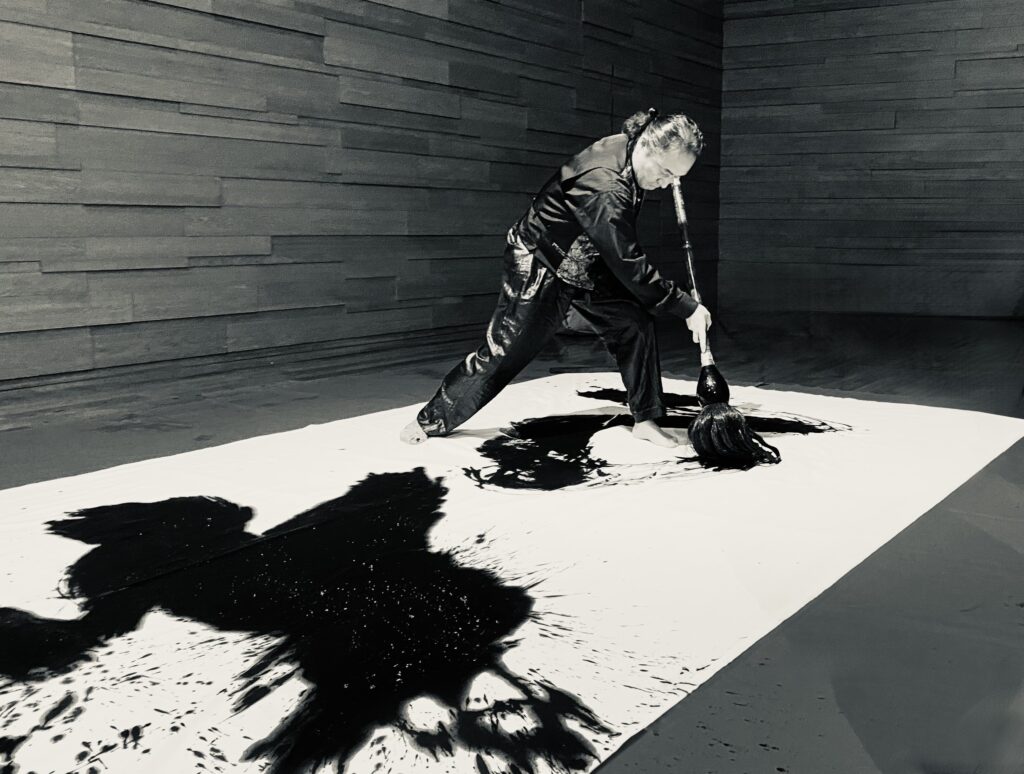
海老原の作品を観れば、墨の色が単一的な黒色ではないことがわかるだろう。同時に黒色にも青みがかっているものから、赤みがかったものまで、鮮やかなグラデーションがあることも見てとれる。ときに淡く、ときに濃密に。18世紀中国・清朝の乾隆帝の庇護のもとに作られた乾隆御墨をはじめ、さまざまな時代に作られた和漢の墨を使い分けている。そして、海老原によれば「墨は最低でも40年は寝かしたものじゃないと、書き味が乗らない」とのこと。そう、墨は銘醸ワインのごとく、時を経て花開き、また枯れていくものなのだ。これは紙も同様で、海老原は数十年以上、熟成させた墨と紙を用いて作品を仕上げる。筆へのこだわりも言うまでもなく、希少な山羊の顎ひげを使い、名人が仕上げるオリジナルの筆を、これまた何十種類も使い分けている。
そうして描かれる作品に確かな骨格をもたらしているのが、1200年前に生きた日本の僧、空海のスピリッツである。空海は仏教を学ぶため、中国に渡り、王羲之から始まる中国書道の極意を掴みとり、平安王朝に帰朝してからは書道の達人として神格化されてきた人物だ。そんな空海の筆跡を海老原は、画家がデッサンを重ねるがごとく、臨書し続けている。
「自分はシャーマン。空海を書くときは空海の魂が自分の中に入っていく。また、その瞬間の感動が言葉や映像となって、雷に打たれたように頭に浮かび、作品を描かずにはいられないときもある」とも海老原は言う。
文字であると同時に、まさに神々しくそびえる富士山そのものの造形をも表すかのような「不二」という作品はその典型だ。言葉や文字と造形が奇跡的に結びつく瞬間そのものが書道というアートの、ひいては海老原の作品の核心かもしれない。
ライター 寺尾妙子
Calligrapher and Ink Artist Rogen Ebihara
Rogen Ebihara is a contemporary artist whose creative foundation is calligraphy. Being an art representing East Asia, what is calligraphy in the first place? The answer is simply this: it is a form of linguistic art in which the subject matter is not a painting but characters, and it focuses not only on the beauty and form of characters but also on the spirituality imbued within them.
To Westerners and others who do not understand Chinese characters, the difference between calligraphy works and abstract paintings may not be distinguishable. In fact, calligraphy-the origins of the writing of Chinese characters-is truly mysterious, tracing back at least 3,500 years to the oracle bone script used for divination in ancient China. These inscriptions contain many pictographic characters that depict the shapes of objects like drawings. To put it differently, Chinese characters are the smallest units of drawings, and writing them is akin to painting.
Furthermore, the avant-garde calligraphy movement that emerged in Japan after World WarⅡ, a style that prioritized “expression” over “readability”-even for those within the Chinese character cultural sphere-caused a major sensation and had a profound impact on the Western art scenes. Yes, calligraphy, as contemporary art, does not require the characters to be legible. At times, calligraphy may even become “non-character.” Yet, it invariably incorporates elements that were once parts of written characters.
At the forefront of this historical trend in calligraphy stands Rogen Ebihara. Ebihara distinguishes between two titles: calligrapher and ink artist. To put it simply, when he calls himself a calligrapher, he creates works that are “legible”; when he calls himself an ink artist, he creates works that are “illegible.”
“I started calligraphy at the age of four, and when I was a junior high student, I saw the works by Jackson Pollock and Antoni Tapies. And, I was intuitively struck and deeply moved by the encounter, ‘This is calligraphy!’.” Ebihara says.
This emotional awakening was the first sign that Ebihara would pursue a path as an ink artist, even as he aspired to be a calligrapher. On the other hand, unlike other artists who use paint, Ebihara is committed to ink-a sumi material highly valued in the world of calligraphy as one of the “Four Treasures of the Study.”
If you appreciate Ebihara’s work, you can see that the color of the ink is not a uniform black. At the same time, you can observe a vivid gradation ranging from black with a bluish tint to black with a reddish tint. Sometimes pale, sometimes dense. He makes a distinction between Japanese and Chinese inks produced in various eras, including the Qianlong Imperial Ink created under the patronage of Emperor Qianlong of the Qing Dynasty in 18th-century China. Furthermore, according to Ebihara, “Ink must be aged for at least 40 years before it develops the right writing quality.” Like fine wine, metaphorically speaking, ink blossoms over time and eventually fades. The same applies to paper; Ebihara completes his works using ink and paper that have been aged for decades or more. Needless to say, he is also particular about his brushes, using dozens of different types of original brushes crafted by master artisans from rare goat whiskers.
What has given these works their solid foundation is the spirit of Kukai, a Japanese Buddhist monk who lived 1,200 years ago. Kukai traveled to China to study Buddhism and mastered the very essence of calligraphy -a tradition beginning with Wang Xizhi-and upon his return to the Heian court, was deified as a master of calligraphy. Ebihara continues to practice calligraphy by copying Kukai’s handwriting, much like a painter making sketches repeatedly.
“I am a shaman. When I write Kukai’s works, his soul enters my being. Also, the emotion of that moment transforms into words and images, popping into my head like being struck by lightning. Inspired and motivated by what has grown deep within my soul, I cannot help but create art
.” Ebihara says.
The work titled “Fuji,” which represents not only the characters themselves but also even the very form of Mount Fuji towering majestically, is a prime example of this. The very moment when words, characters and form miraculously converge may be the core of Ebihara’s creation as well as that of the art of calligraphy.
Text by Taeko Terao